How To Take Better Pictures of Your Handmade CardsDecember 6, 2021 |
When I first started out taking pictures of my handmade cards, I just took the picture of my card on my craft mat and voila! Then the more time I spent on Instagram; I became so envious of all these professional looking photos of handmade cards. They looked as if they belonged in a magazine! So off I went trying to find a non-expensive way to make my photos look more “professional” or at least better than what I was doing! Along the way, I learned that although there are things that you can do to improve your pictures, a lot of it is personal and how you want your photos to look!
Where to look to find answers
After doing various Google searches ranging from very technical to just tips and tricks, it was a lot to process! Then I thought about reaching out to other card makers that incorporated all those items that I wanted to learn more about. I was not surprised when I reached out to ask questions about how they take their great photos, they were more than happy to help me! So, I started a list of feasible, non-expensive things that I can do to improve my photography skills!
Good news, you can keep the device you are using
So, the good news is that you can keep the device you are currently using, whether it be a camera, cell phone, or iPad. The first thing you need to do is read up on your device! Make yourself familiar with all the things your device can do. You can look at the informational booklet that came with it or you can google your device and how to take optimal pictures. The main goal is to increase the light in your photos! DO NOT USE A FLASH under any circumstances when taking photos inside. It creates unnatural shadows and makes the photo look flat and unnatural!
Is a light box for you?
Since one of the main objectives is to increase the light in your pictures, you could make or purchase a Light Box! I purchased a light box at the $5 and under store for $10. It had the LED lights attached to the box; however, it was small. I think it was more for taking pictures of jewelry. I also made a light box, but I have a limited craft space, so it just took up too much room! I have talked with several people who use a light box, and their pictures are beautiful! Using a light box may be just the thing you are looking for, but it just was not the easiest for me.
Use that big window
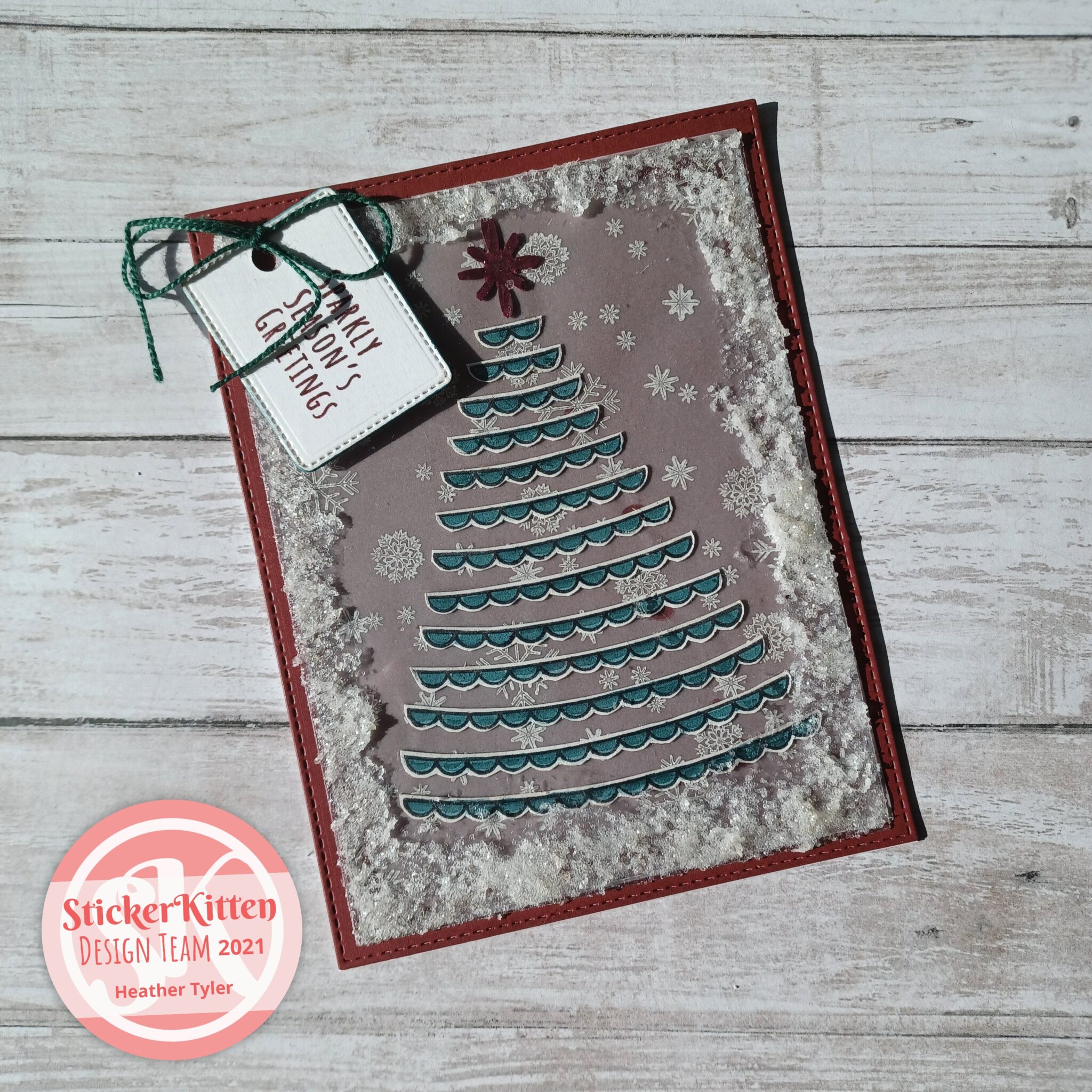
As I said before, I have limited area to craft, however I have a big window right next to where I sit. Yes, this will be my source for natural light to take my pictures! A lot of times I just open my blinds, lay down my background and the pictures turn out wonderful! However, there are some pitfalls. First you need to find the right time of day the natural light hits your card just right. For me, the afternoon sun is best for me! Now what happens if there is no sun, well there is still natural light, you just need a little extra help! Sometimes if there is no sun, I use a LED ring light to add to the natural light and remember to change the settings on my camera. If the sun is out but not just as bright (partly cloudy), I use a light reflecting board covered in aluminum foil or just a white board on the opposite side of the window to reflect light onto the card. The main point I can make is find out what works for you. Just keep trying!
To add or not to add
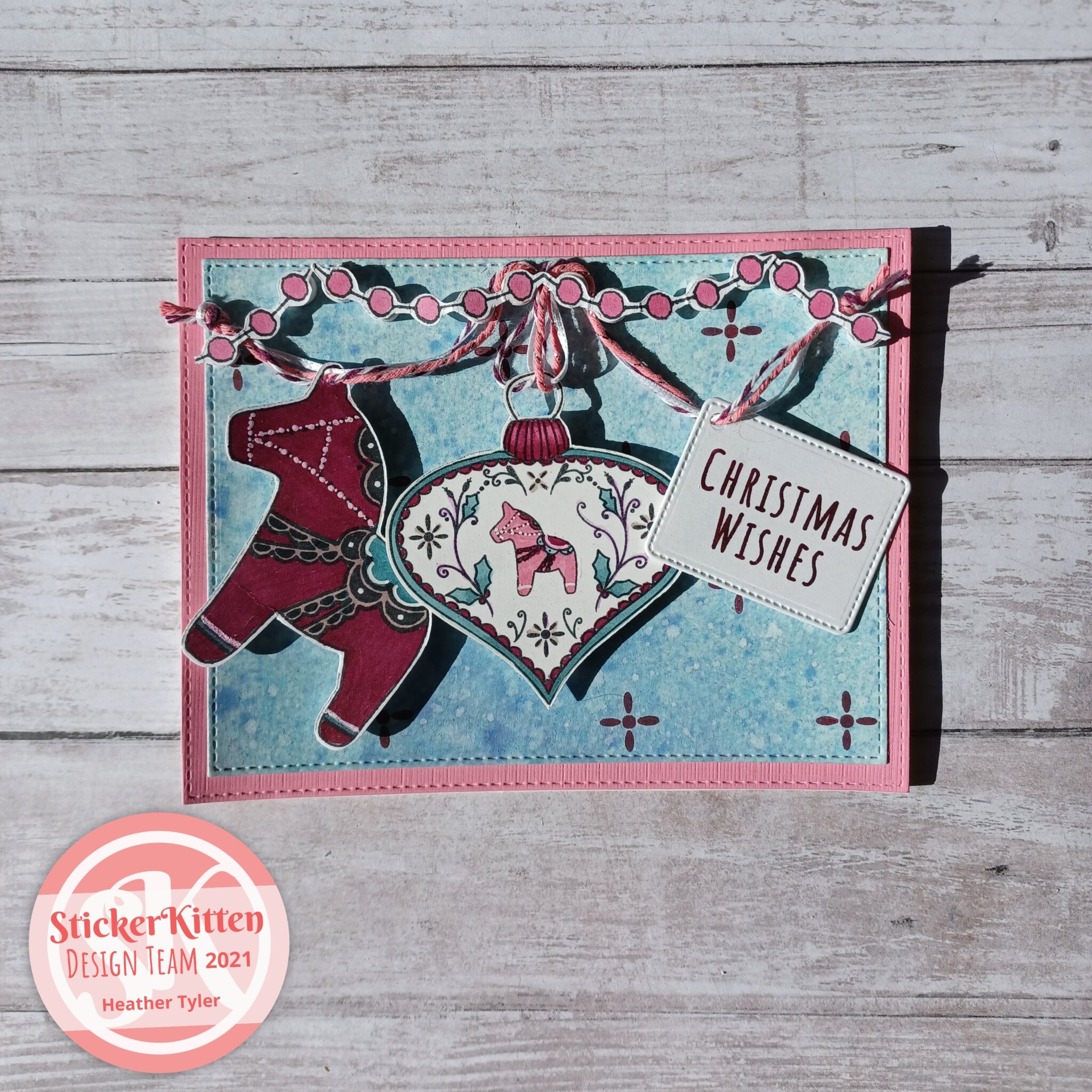
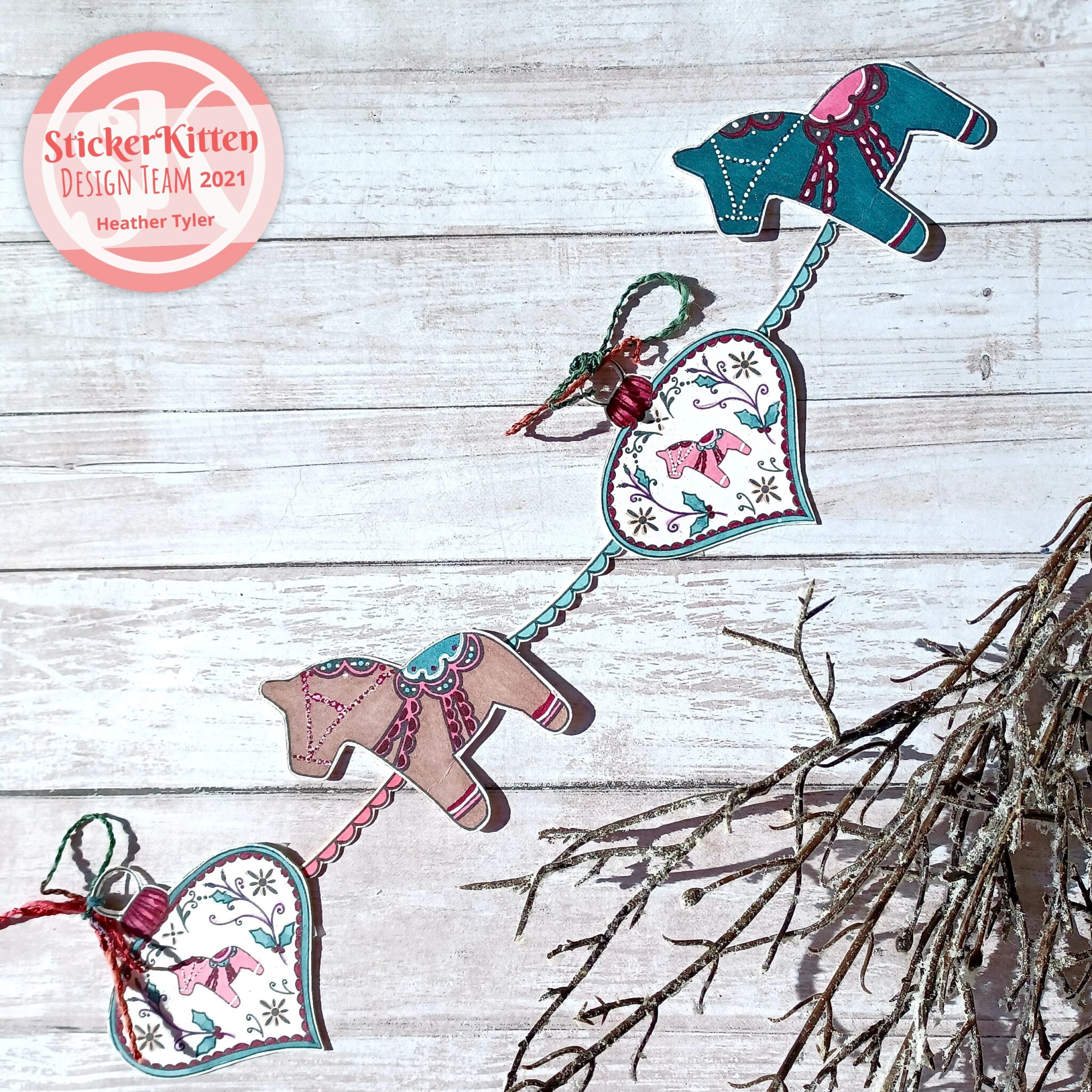
The next question in the photography process is what type of background do I create; do I add items in my photo other than the card? In speaking with a lot of seasoned card makers one of the most important points they all make is that it depends on your style or what type of style you want to create. All of them have a background they use specifically to take pictures with. It could be a plain white background; it could be a light wood plank background; whatever you choose to make sure it does not take away from your card and goes with every colour. Now do I add the stamp set, the die, the ink I used, a flower, or a fancy pen? Honestly, it is up to you! If you are taking pictures for your Instagram, you want some type of cohesion. Its also important that whatever you place in your picture is balanced and the items are not taking away from your card. A plus to using the same items in your pictures, others will start to recognise your pictures. For example, one card maker always places the caps of her copic markers in the same place in every picture. Not only do the colours compliment the card, but I also know that most likely this is her picture!
Everyday I am continually learning how to be a better photographer, I am constantly working on my craft, on finding my niche! Research, implement and if it does not work, do the process over again! You will find your way, you just need to put some effort and thought into! The best advice I can give is find out what works best for you!
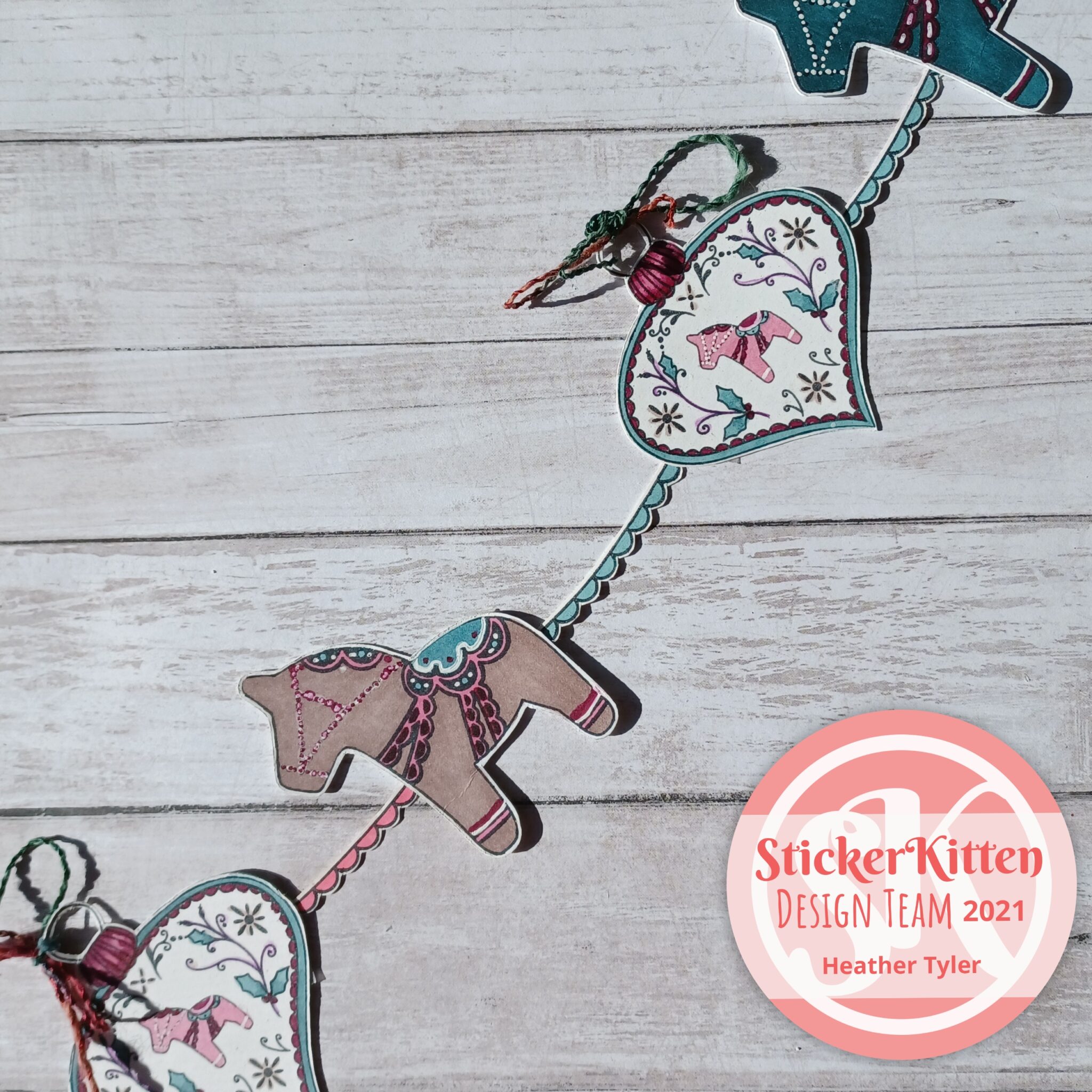
The stamp sets that I have used for this blog are Dala Horse, Dala Horse Baubles, and Alpaca Wishes from Sticker Kitten.
Heather Tyler / Qtee Card Designs
